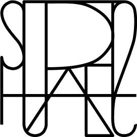
SUAREZ'S NEW LOGO AND EVOLUTION SINCE 1943
We celebrate the launch of the new Suarez logo by reviewing its aesthetic evolution from 1943 to today.
Without a doubt, one of our most representative symbols is the surname that gives the brand its name and therefore shapes our visual identity.
Like each and every one of our icons, the Suarez logo has evolved over the years, adapting to the latest luxury trends without losing sight of the essence of what Don Emiliano Suárez Faffián began in 1943.
In the following years, the founding year was omitted again, a way of highlighting the proximity of the 80th anniversary, allowing the family name itself to embody the significance of Suárez's eight decades of history.
A prelude to the new logo we're launching now, with a highly refined aesthetic, aligned with contemporary luxury trends, which at a glance manages to unite everything we want to convey through our creations and the great team behind them.
A clear example of excellence, transparency, and contemporaneity that, although it may undergo slight modifications, will continue to maintain the family essence and the finest jewelry expertise.


